Rockerhair
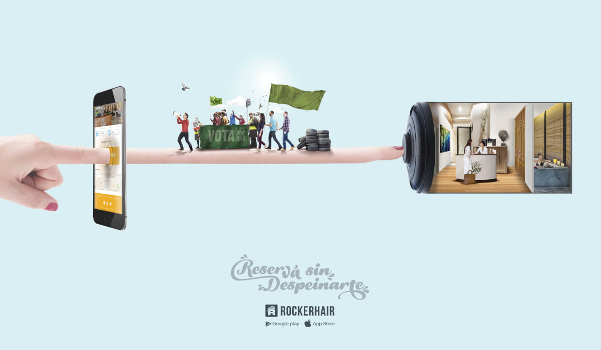
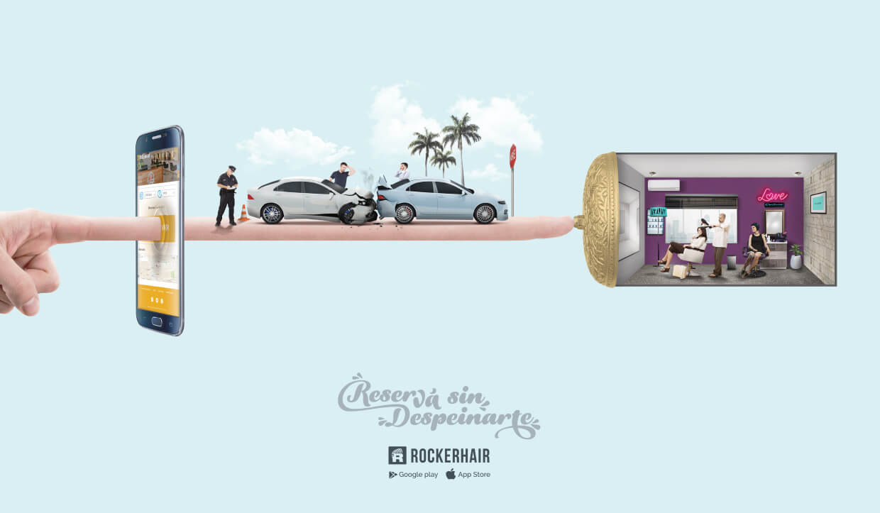
RockerHair es una app mobile uruguaya para reservar turnos en peluquerías, spa y centros estéticos. El proyecto ha generado tracción en siguientes países de América: Uruguay, Argentina, Chile, Paraguay, Colombia, Brasil y República Dominicana. El público objetivo de la marca es todas aquellas personas con perfil tecnológico que toman enserio su imágen.

Branding campaing 2016
An idea with the potential to become an epidemic. Thus began this action that little by little was infecting all involved.
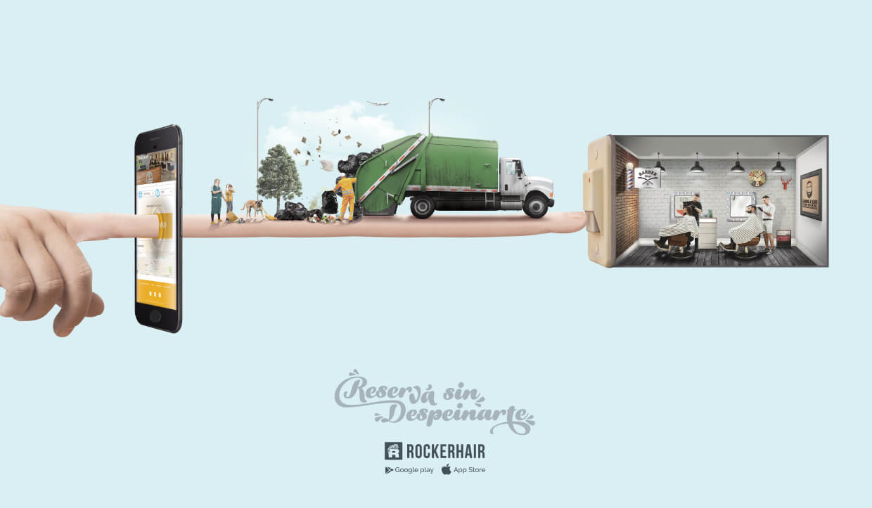
In order to communicate the advantages of the brand, a graphic campaign was created under the concept “Reservé sin despeinarte”, highlighting the differential that with the application you can avoid all the problems or waiting that entails a traditional reservation.

Identity
In order to renew the image of the brand we sought to move away from the initial idea, which had a clear trend to the male Hipster style. In this way we seek to achieve a unisex and modern image, with a technological profile.

Concept
Watch
The primary functionality of this service is to book a shift, an hour at the hairdresser or beauty salon, but also a service that eliminates waiting both on the phone and in the living room, therefore the? Time element / clock describes perfectly one of the main concepts of the service.
Scissors
Again we go to basic concepts and above all to the roots of the service. The word Hair in the name of the company directs the service to hairdressers or hair care.
This is the element related to the beauty that has the mark. For this we see positive the use of some element that makes some reference to the concept, and the element more clear for the subject are the scissors.
V + R fingers upside down
The third concept to reflect in the logo, is the root of the name “Rocker”.
It is necessary to reflect rock in the logo, but we must move away from the classic image of rock, that image broken and untidy, as this company is about aesthetics.
So we take the spirit of rock, freedom, rebellion, transformations, good vibes, doing what you feel to see as you want.
Given these arguments we reflect 2 symbols of the rock in this logo, on the one hand the fingers in V, symbol of peace of the hippies of the 60 that is related directly with the rock and a greeting of good wave that has not lost validity between the young boys.
In addition the other symbol is the reverse R symbol of rebellion and transformation, basic concepts of Rock, which relates directly to the aesthetic transformations that one makes for oneself.