


[:es]


Campaña de Branding 2016
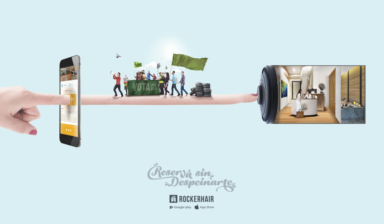
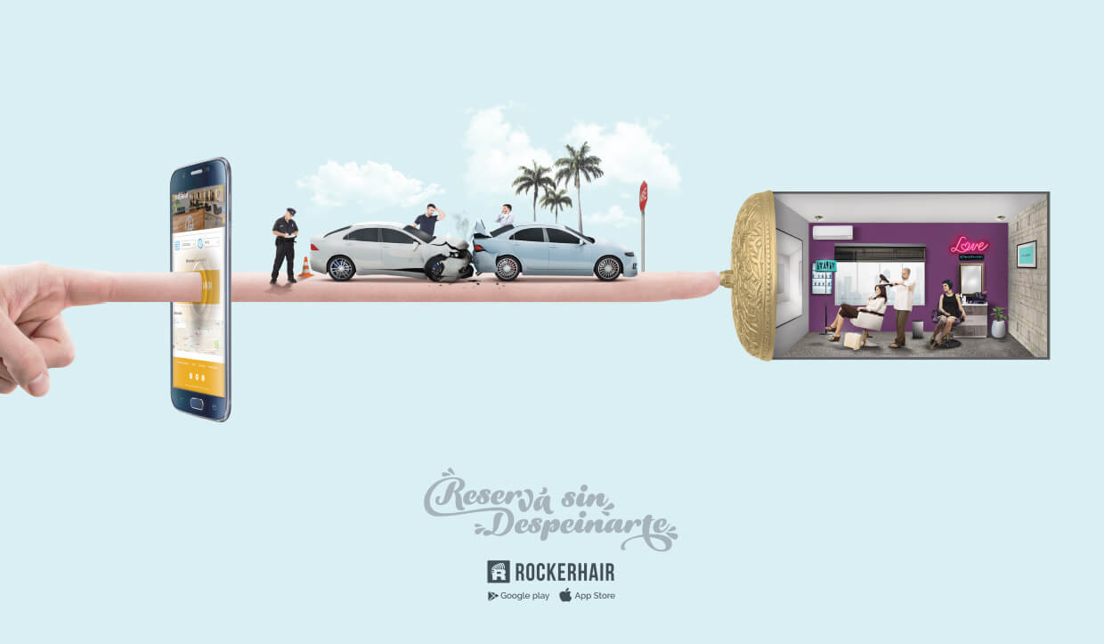
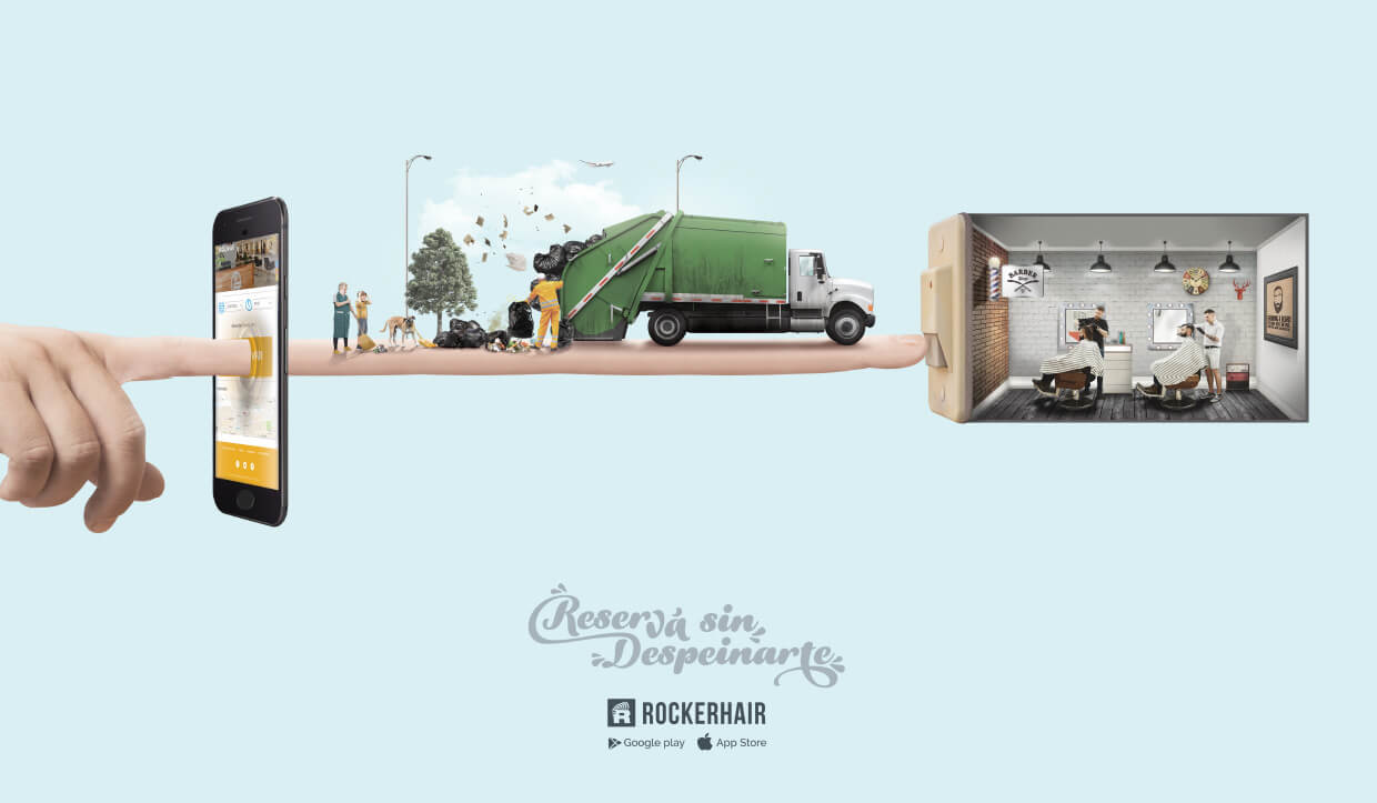
Para comunicar las ventajas de la marca se creo una campaña gráfica bajo el concepto “Reservá sin despeinarte”, destacando el diferencial que con la aplicación se puede evitar todos los problemas o esperas que conlleva una reserva tradicional.



Identidad
Con el fin de renovar la imagen de la marca buscamos alejarnos de la idea inicial, la cual tenía una tendencia clara al estilo Hipster masculino.
De esta manera buscamos lograr una imagen unisex y moderna, con un perfil tecnológico.


Concepto
Reloj
La funcionalidad primaria de este servicio es la de reservar un turno, una hora en la peluquería o salón de belleza, pero además es un servicio que elimina las esperas tanto al teléfono como en el salón, por lo tanto el elemento tiempo / reloj describe perfectamente uno de los concepto principales del servicio.
Tijera
Nuevamente vamos a conceptos básicos y sobretodo a las raíces del servicio. La palabra Hair en el nombre de la empresa direcciona el servicio a peluquerías o cuidados de cabello.
Este es el elemento relacionado a la belleza que tiene la marca. Para esto vemos positivo la utilización de algún elemento que haga cierta referencia al concepto, y el elemento más claro para el tema son las tijeras.
Dedos en V + R al revés
El tercer concepto por reflejar en el logo, es la raíz del nombre “Rocker”.
Es necesario reflejar rock en el logo, pero debemos alejarnos de la imagen clásica del rock, esa imagen rota y desprolija, ya que esta empresa se trata de estética.
Por lo tanto tomamos el espíritu del rock, la libertad, la rebeldía, las transformaciones, la buena onda, el hacer lo que uno siente para verse como uno quiere.
Dado estos argumentos reflejamos 2 símbolos del rock en este logo, por un lado los dedos en V, símbolo de paz de los hippies de los 60 que se relaciona directamente con el rock y un saludo de buena onda que no ha perdido vigencia entre los jóvenes.
Además el otro símbolo es la R al revés símbolo de rebeldía y transformación, conceptos básicos del Rock, que se relaciona directamente con las transformaciones estéticas que uno hace para sí mismo.

[:en]
Branding campaing 2016
An idea with the potential to become an epidemic. Thus began this action that little by little was infecting all involved.
In order to communicate the advantages of the brand, a graphic campaign was created under the concept «Reservé sin despeinarte», highlighting the differential that with the application you can avoid all the problems or waiting that entails a traditional reservation.
Identity
In order to renew the image of the brand we sought to move away from the initial idea, which had a clear trend to the male Hipster style. In this way we seek to achieve a unisex and modern image, with a technological profile.
Concept
Watch
The primary functionality of this service is to book a shift, an hour at the hairdresser or beauty salon, but also a service that eliminates waiting both on the phone and in the living room, therefore the? Time element / clock describes perfectly one of the main concepts of the service.
Scissors
Again we go to basic concepts and above all to the roots of the service. The word Hair in the name of the company directs the service to hairdressers or hair care.
This is the element related to the beauty that has the mark. For this we see positive the use of some element that makes some reference to the concept, and the element more clear for the subject are the scissors.
V + R fingers upside down
The third concept to reflect in the logo, is the root of the name «Rocker».
It is necessary to reflect rock in the logo, but we must move away from the classic image of rock, that image broken and untidy, as this company is about aesthetics.
So we take the spirit of rock, freedom, rebellion, transformations, good vibes, doing what you feel to see as you want.
Given these arguments we reflect 2 symbols of the rock in this logo, on the one hand the fingers in V, symbol of peace of the hippies of the 60 that is related directly with the rock and a greeting of good wave that has not lost validity between the young boys.
In addition the other symbol is the reverse R symbol of rebellion and transformation, basic concepts of Rock, which relates directly to the aesthetic transformations that one makes for oneself.
[:]